Color Palettes That Work (And Tools to Create Them)
by Jason Forrest
Insights / Graphic Design /
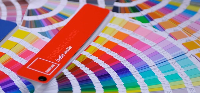
Photo by Rocco Lucia (Flickr)
A color palette is the set of colors that a designer chooses to create a visual style for an image, graphic or website – basically any design they do.
It’s also a powerful user experience tool that sets the tone of the design, so being able to create an effective color palette makes you a sneaky master of manipulation.
Let’s take a look at why some color palettes work, why others don’t and how to create ones that deliver the impression you’re looking for.
How Do I Know if a Color Palette is Working?
This is actually a very tricky question, and there’s no guaranteed answer.
Color design is very subjective from person to person and even across cultures. Take a look at this chart showing how colors are interpreted in different cultures (designed by David McCandless and alwayswithhonor.com).
You can see how in the West, death is associated with the color black, while in Hindu and Chinese cultures it is represented by white. So a Chinese designer creating a website for a western funeral home may decide to use a predominately white color palette, but we would probably say that palette wasn’t appropriate.
Then there are personal biases, like the way an individual’s eyes perceive color.
The point? It’s an inexact science.
But to best answer the question, we have to look at it from a defined viewpoint of who the client and the audience are.
Let’s take a look at some color palettes that don’t work.
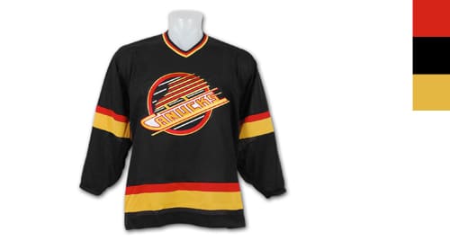
The first color palette fail that comes to mind is the Vancouver Canucks jersey from 1978 to 1997. This jersey is widely regarded as the worst jersey in all of sports. While the color palette somewhat resembles the German flag, they’re not the German national team – they’re a hockey team from Vancouver, British Columbia.
The palette doesn’t work because it is completely out of context.
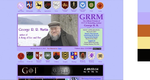
I love George R.R. Martin as much as the next Game of Thrones fan, but his (now former) website was an eyesore. Nothing about it says famous author of a spellbinding fantasy series. The indigo on violet combination screams “Mother’s Day,” and the last thing you want to think about is George R.R. Martin and your mother at the same time.
Throw in the maroon and yellow house emblems dotting the page, and you can understand why he had it redesigned. Thanks George. Love your stories.
Now let’s talk about palettes that do work.
When we designed the color palette for the Jericho City of Praise website, we knew that we wanted the people using the site to get the same experience that they would during services. So we brainstormed keywords associated with the experience of going to church, like Heaven, Angels, Sky, Clouds, Sunlight, Joy, Kingdom, and Elation.
The obvious color choices expressing those keywords are white, light blue and gold. From there, we needed to choose colors that complement those core colors and apply them to the site. This was the end product:

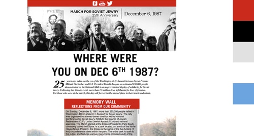
When we designed a website for The Jewish Federation of Greater Washington to commemorate the 25th anniversary of the March for Soviet Jewry, we again brainstormed keywords and phrases that came to mind, like Hope, Determination, Freedom, Grit, and the Soviet Union. We decided that red (obvious), blue, white and grey matched those phrases well, and this was the result:
What Tools Exist to Create a Color Palette?
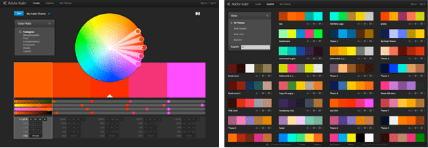
If you need to create a color palette, you best friend is Adobe Color.
Color is an amazingly useful color palette utility that lets you browse thousands of user-created palettes and allows you to create your own palette using their robust editor. Bonus: it’s built into most Adobe CS applications for easy access. What an age we live in.
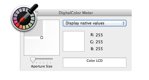
On many projects we work on, we’ll often receive just a logo or existing branding and need to develop a color palette from that. I like to use the OS X Digital ColorMeter utility to find the predominant RGB or CMYK color value and enter it into Color and see what it generates based on what kind of color palette I want (analogous, monochromatic, complementary, etc…).
That helps us experiment with what works and what doesn’t.
My heart will always be with Color, but some people (communists mostly) use ColourLovers. It allows you to download their color creation utility to your desktop, independent of any design software.
If you’d like to hear me rant more about color palettes, and how I could use my opinions and skills to help you, contact me at forrest@dgtlnk.com.
About Jason Forrest
Digital Ink tells stories for forward-thinking businesses, mission-driven organizations, and marketing and technology agencies in need of a creative and digital partner.
Other Stories You May Like