Skeuomorphism or Flat Design: Which is Better?
by Christopher Young, Graphic Design Intern
Insights / Graphic Design /
In the rapidly evolving digital world, we designers are constantly learning new approaches to create designs that are as user-friendly as possible.
Currently, there are two very different ideas as to how accomplish design usability: skeuomorphism and flat design. Skeuomorphism became heavily favored in the early days of the new millenium, while flat design seems to have (for now) claimed the throne.
Both of these styles can offer a great user experience, but is one better, or more appropriate, than the other?
Skeuomorphism: Mimicking Real Life Designs
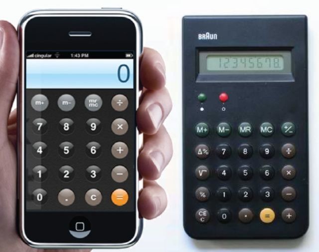
Skeuomorphism is a design style wherein elements like icons or buttons are designed to replicate or mimic their real world counterparts. This gives the user instant familiarity, which allows them to easily identify the element and what function it serves.
Skeuomorphism was first brought into the public eye by Apple in the early 2000s in an effort to try and make the computer desktop environment seem simple. For example, the old design for the iPhone’s calculator app was purposefully made to resemble a real calculator so that their users would be immediately comfortable using it.
Until recent years, skeuomorphism was the undisputed king of the web design world because it successfully transitioned users who grew up without digital devices to a world where they fully rely on them to complete their day. Skeuomorphism has helped to bridged the gap between the user and their device.
Think about this: in the US in 1998, nearly 42% of US households owned a home computer, and by 2010, nearly 70% owned computers. So by 2010, the majority of the US population was familiar with a skeuomorphic environment and owned at least one device that utilized a skeuomorphic design.
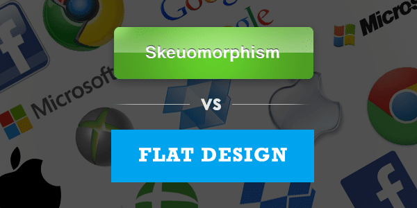
Flat Design: Less Real World, More Digital
With flat design, simplicity is king. It shifts the focus away from photo realism and instead aims to elegantly display content on small screens while keeping their file size as low as possible.
The extra bells and whistles like transparency, drop shadows, and gradients were eliminated or subdued in order to emphasize the content itself, and menus were simplified to make them easier to access on small screens. Most importantly, flat designs tend to work best with responsive websites.
Skeuomorphism or Flat Design: Which is Better?
This is a difficult question to answer, and the debate continues to rage on. Both of these design approaches give designers a clear roadmap as to what is considered “good,” which can save a lot of time. As is the same with any trend, designers have a fear of being seen as jumping on the bandwagon without thinking their decisions through.
On one hand, skeuomorphism offers users a familiar experience, but it’s arguable as to whether it’s “good” design. If you’re still anchored to the way things have appeared in the past, you are stifling opportunities to innovate and bring something new to the table. On the other, flat design is attempting to display content in a way that is modern and easy to understand. Unfortunately, its minimal approach can be confusing for some users.
An example of this was seen in the consumer backlash Windows 8 first experienced. Apple’s switch in iOS 7 to flat design was a turning point for the company, which previously embraced skeuomorphism but made it clear that moving forward it would be adopting a flat design approach.
Ironically, the success of flat design probably wouldn’t have been as widespread if skeuomorphism hadn’t been there years prior to educate the public on how to use computers. Jony Ive, Senior VP at Apple was quoted as saying that “skeuomorphism is a solution to a problem that iOS no longer has,” further confirming they have no intentions of returning to it in the future.
With more and more mobile devices being used everyday, flat design has surged in usage, with Windows 8 and Android instrumental in its widespread implementation. Given Apple’s switch to flat design for it’s iOS devices and that, as of January, it was estimated that Android made up 70% of all smartphone sales, at least for now flat design are currently the majority of all mobile user experiences.
But shoehorning clients into a certain style just because it is popular is never the best idea. In the end, whether it’s a complete web design, logo or Powerpoint presentation, the best solution is the one that makes the most sense for our client.
About Christopher Young
Chris graduated in 2013 from Moravian College in Bethlehem, PA with a degree in Graphic Design and Studio Art. Before being hired as an Intern at Junger Media, he worked as a freelance designer. His past clientele consisted primarily of musicians from Philadelphia’s thriving music scene.
Other Stories You May Like


