The Sticky Nav: The Menu that Follows You
by Jason Unger, Founder
Insights / Website Design /
As more sites that we design use the powerful combination of WordPress and Bootstrap, we’re taking advantage of every design and tech feature at our disposal.
The Bootstrap framework contains a built-in “fixed navbar”, also known as a sticky navigation or follow menu. Essentially, it’s a menu that follows you as you scroll down the page, keeping the top navigation accessible no matter where you are. Here’s the default Bootstrap example.
You can see the sticky nav in action here on our site or on the recently redesigned Fanspeak site. It’s also used on Facebook and on Google+, so you’ve likely experienced it before.
I wish I could share how or why sticky navs became trendy in web design, but there’s not an obvious “this site did it first” or “these reasons led to the growth in sticky navs.” The closest we can probably get is that it’s grown with the growth of Bootstrap, since that framework is used by many sites and the sticky nav is a built-in option.
Honestly, the trend may have sprung out of social networking sites that added a top navigation bar to their links, like the infamous DiggBar or StumbleUpon’s StumbleBar. While those were third-party menu bars, the idea was very similar to today’s sticky navs.
Is the Sticky Nav Right For Your Site?
You have to evaluate the decision to include or exclude a sticky nav based on two things: design and usability.
The usability angle, believe it or not, is really straight-forward. Smashing Magazine, a website for developers and designers, did a usability study in 2012 that found that sticky navs provided a 22% faster way to navigate the site. And when comparing sites with a sticky nav to sites without one, the respondents who had a preference all picked the site with the sticky nav.
Many comments along this line were made, such as “I don’t know how the websites were different, but I felt like I was spending a lot less time clicking with the first one.” Such comments indicated overwhelming favor for the sticky navigation.
As more sites turn into “perpetual content” sites — you know, where when you finish scrolling through one article, another appears (like The Daily Beast) — or use Parallax web design, scrolling back to the top is almost as difficult as finding the last level in Candy Crush Saga. So you need to have a menu that stays with the user as they scroll.
The Design Angle
If you’re going to use a sticky nav, you obviously have some design considerations to work out.
Will your sticky nav have a background color? If so, it’ll need to fit in with every part of the site, no matter where the user has scrolled to. That likely means it needs to stand out and feel like a unique element on the page.
How can you keep your branding front-of-mind, especially if you can’t include your full logo in the sticky nav?
What will the sticky nav look like and how will it work on mobile devices? If your site is responsive (and it should be), including a hamburger icon may be the best option.
Are your navigation links styled in such a way that they’re distinguishable from other links on the page, but not so dissimilar that they look out of place?
Sticky navs also give you an opportunity to always highlight your call to action. Did you notice that on the Digital Ink site, the “Contact” link is set off in a different background color? That’s because we want you to contact us, and we’re making it obvious that’s what you should do.
What Could Possibly Go Wrong?
It sounds like common sense, but a sticky nav can go wrong, both with design and usability.
Here’s some tips on what to avoid with a sticky nav.
- Don’t have too many items — especially ones that aren’t navigation items.
- Don’t oversell it. There’s nothing wrong with including an obvious call to action, but don’t be annoying and have promotions follow the user throughout the site.
- Be careful with dropdowns and mega-menus. A sticky nav should be easy to use, and if you have a lot of dropdown options or mega-menus with thumbnail graphics, it starts to get complicated. We often remove the dropdown options from a menu when it shifts into a sticky nav.
- Use the right technology. Don’t use iFrames. They’re bad for everyone.
Interested in seeing a selection of sites that use sticky navs in neat ways? Check out this list from the Awwwards site.
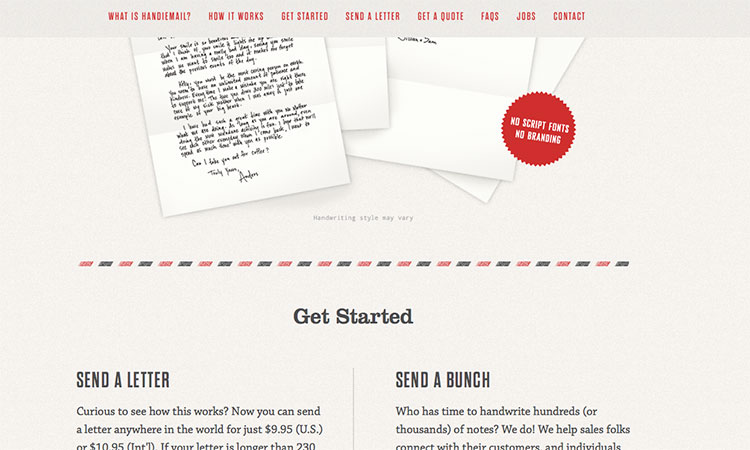
Image is of the Handiemail site.
About Jason Unger
Jason Unger is the Founder of Digital Ink. He built his first website on Geocities, and hasn't looked back since. Digital Ink tells stories for forward-thinking businesses, mission-driven organizations, and marketing and technology agencies in need of a creative and digital partner.
Other Stories You May Like