Stop Making These Common Design Mistakes: Typography
by Jason Forrest
Insights / Graphic Design /
Good typography is arguably the most important element of strong design.
In this era of responsive web design, where graphics aren’t static elements and typography provides the framework for the look and feel of everything, getting it right is important.
Unfortunately, not everyone is a trained designer and mistakes are bound to happen.
Fortunately, we’re here to help you to stop making these common typography mistakes.
Using Too Many Typefaces
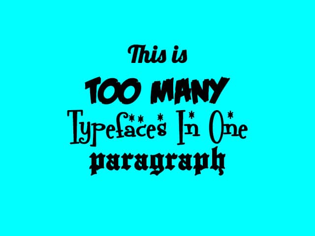
We’re no longer living in the web-safe font era.
But just because @font-face, TypeKit, and Google Fonts have given you have access to every conceivable typeface on the planet doesn’t mean you should use them all.
My rule of thumb is to =use two typefaces maximum, along with only two or three weight variations like italic, bold, semi-bold or medium. This provides a good balance to your designs without it feeling overwhelming.
Bonus: it also reduces page load time.
Bad Font-Pairing
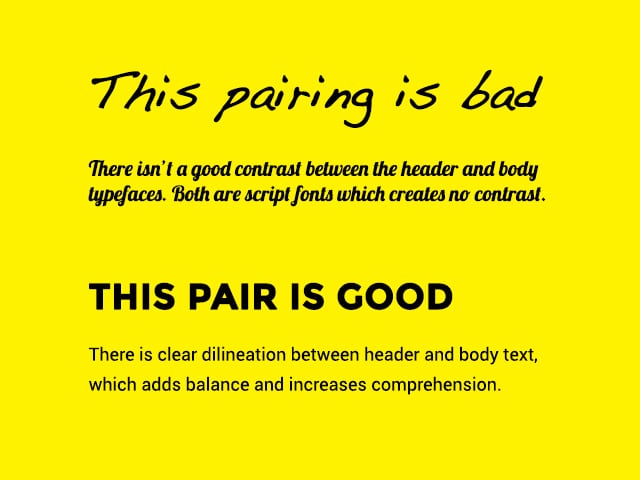
Certain typeface styles work together better than others, and contrast is essential for good font pairing.
For example, a sans-serif font like Montserrat, which has many different weights to choose from, pairs well with a serif font like Roboto.
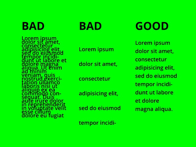
Lacking Typographic Hierarchy
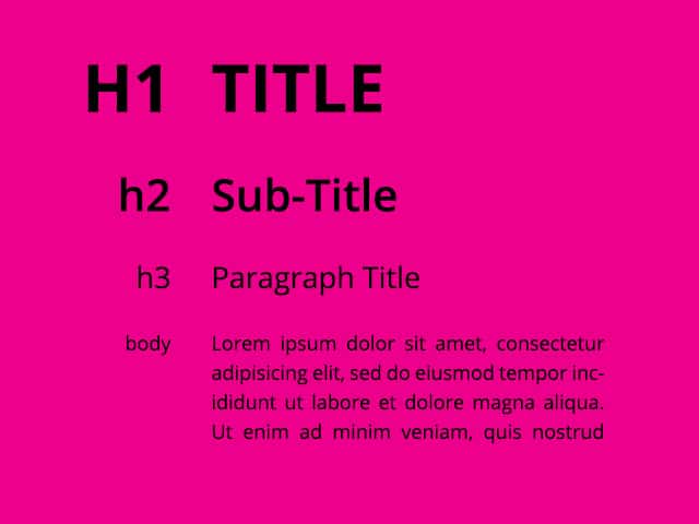
Typographic hierarchy establishes the order of importance of your copy.
Without a clear hierarchy, it is hard to understand the content’s importance. In web design, this typically means establishing styles for body text (p), and a few styles for header text (h1, h2, h3).
In my designs, I like to make sure that everything – font size, line-height, padding, and margin – is all divisible by a simple prime number, like 3. For example, a typical setup is 12px, 18px, 27px, 40.5px, 60.75px, all set at 1.5 em line-height.
You can use sites like modular scale to help develop a strong typographic hierarchy.
Insufficient or Too Much Leading
Leading, or line-height, is the space between lines in a block of text. It literally refers to the bits of lead that typesetters would place between each line of text.
Not using enough leading will make lines of text look squished and totally unpleasant to look at.
=Using too much leading will create the impression that the lines in your text block are unrelated separate thoughts, and will, therefore, be just as incomprehensible as using too little leading.
Bad Kerning
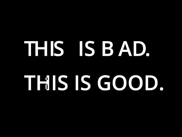
Kerning is the space between two individual letters in a word, and when it is bad it can cause all sorts of unintended consequences. Nothing distresses a designer more than bad kerning.
You don’t have to be an expert in typography to spot or fix bad kerning.
I typically rely on layout software like InDesign to handle kerning for me and tend to steer away from typefaces with obviously whacky kerning that I’ll have to spend time manually adjusting.
Ultimately, kerning is all about perception. You’ll have to rely on your own eyes to tell you if your kerning is good. 99designs has a good guide on kerning best practices.
Improper Text Alignment
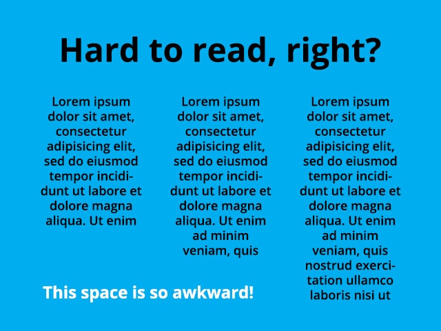
With so many websites using frameworks like Bootstrap that have twelve column layouts, I often see designs with long columns of center-aligned body text.
A good rule of thumb is that =centering text works best for short headlines or descriptions, while text blocks with multiple lines are best left or right aligned.
In some cases, especially in layouts that utilize multiple narrow columns, it makes sense to justify text blocks. However, justifying text often results in an awkward spacing between words that requires manually adjusting text tracking, which is sometimes impossible to do in responsive designs.
Text Orphans and Rags
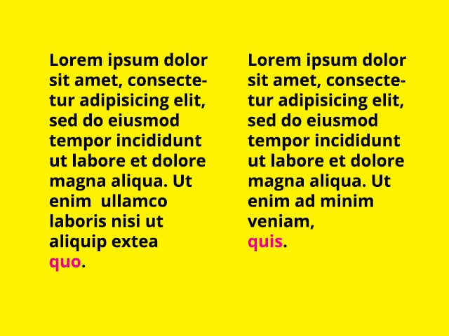
Orphans (or widows) are that one word that’s left on its own line at the end of a text block.
While this might not be the worst design mistakes, it is a personal nitpick and was one of the first things I learned not to do when I started as a designer.
I always search my designs for orphans after I’ve gotten final edited content and laid it out. The best way to fix an orphan is to reword the paragraph or use a line break and bump down the previous word to the next line. If that isn’t an option, adjust the tracking to condense or expand the line of text, making sure not to exceed more than -20/+20 points of tracking.
Rags are the ragged areas of space between columns of left or right aligned text. When they are unbalanced, they can be distracting to the eye and unattractive. They can be fixed just like orphans by manually inserting line breaks or adjusting tracking.
The next post in our common design mistakes series will focus on graphics.
Photo by Alexander Andrews on Unsplash
About Jason Forrest
Digital Ink tells stories for forward-thinking businesses, mission-driven organizations, and marketing and technology agencies in need of a creative and digital partner.
Other Stories You May Like